Wednesday, November 16, 2022

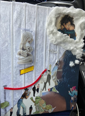
Self Portrait Project Collage


The Art Gallery, Julianna Menjivar-Sanchez

The Art Gallery, Julianna Menjivar-Sanchez

The Broken Column, Frida Kahlo

My Nurse and I, Frida Kahlo


        The title of my project is The Art Gallery. For my project, I used: a canvas, a printer to print my photos, cotton balls, magazines for the audience of people, crazy glue, plastic, hot glue, ribbon, a pen, and a red metallic material with fuzz. The materials were pretty easy to put together on the canvas. I think the only hardest part was when I was cutting the people and animals from the magazine. In class last week, I had sketched out my idea on a piece of paper. I had written the materials I wanted to use, the ideas I had set in mind, and what artists were inspiring me. For one, I thought of Mickalene Thomas because of the textured background she uses in her artwork, so with that thought I had looked at the art store for e textured background that wasn't too much nor too little for my project. I went with this white ribbon that feels like velvet material. And I went with white so it wouldn't distract too much from the message. Another artist that inspired me was Cindy Sherman and Frida Kahlo because of their artwork that defies the male gaze. And with that thought, I know I wanted to do my self-portrait project collage on my life as a mother. So I chose myself looking at art that relates to motherhood which would eventually make me think of my son and I. While searching the internet, I found this picture of a mother breastfeeding her child. It was perfect for my project because I believe it defies the male gaze. I wanted to highlight this piece in my artwork by making it stand out in plastic as if it was in a glaze. Breastfeeding is something that some of the public tends to find disgusting. If it's not women showing off their body for nudity and to "please" men, then it should not be shown, such as women breastfeeding in public. Women are shamed into hiding that they are breastfeeding their child- a natural thing that feeds and gives nutrients to their child. Frida Kahlo and Cindy Sherman have both defied the male gaze in their artwork. Especially with Frida Kahlo, she did not portray the beauty and nudity that is expected to please men and their gaze. Instead she showcased her true self and her pain through nudity such as in her work of "The Broken Column".  In the NY Times article, “Frida Kahlo Was a Painter, a Brand Builder, a Survivor. And So Much More.”, it states, “Ms. Small pointed out that Kahlo “carefully groomed her unibrow,” a defiant choice at a time when “many depilatory methods existed. That brow was meaningful because it didn’t conform to Hollywood beauty standards.”” This shows how Frida Kahlo cared about how she looked, even if it wasn't accepted by beauty standards such as her embracing her unibrow, which for women is supposed to be "ugly".  Another quote from the NY Times article states, “But Kahlo did not conceal her pain, revealing her casts and leather braces with metal buckles in her work and turning her plaster corsets into art with elaborate designs of flowers, even a hammer and sickle. “She treated these second skins as canvases,” Ms. Small said.”" This shows how Frida Kahlo displayed her pain in her art, she did not hide anything. She again, embraced who she is, regardless of the pain and mechanical devices that were helping her live. She treated these "disabilities" into artwork. Another piece that inspired me was by Frida Kahlo as well, titled, "My Nurse and I". I had only noticed this artwork after I had sketched out my idea and chosen to do breastfeeding as my message. And I think finding her artwork just correlates with my project perfectly. You see Frida with a grown adult face breastfeeding from a woman, who is leaking milk. And on the other breast that is feeding Frida, you see the ducts and glands of the lactating breast. Yet you can see there is no bond between the wet nurse and Frida, which in my project you do see a bond between the mother and child. She is caressing the breastfed child and looking at the baby. Yet in her art, some might want to look away because it is not "beautiful", but instead demonstrating her life and pain. Lastly, another quote from the same NY Times article states, “People have described her as broken and fragile, but she was strong and accomplished a tremendous amount in her lifetime.” I personally liked this quote because when looking at her artwork, you can see how broken she might look because it is displaying her pain from a child to adulthood. But yet, she was not fragile and broken, she was strong because she embraced all of this in her artwork. She did so much with her artwork and in her life, she deserves more than being looked at as broken and fragile because she was the opposite.
        With that, my project addresses the theme of male gaze, female gaze and identity. With my work I am focusing on my identity as a mother, defying the male gaze by instead shifting it into a female gaze and showing altogether the reality of motherhood. I think that contemporary media plays a role in identity, cultural and societal norms because it makes people want to be able to fit in to satisfy "societal norms". I feel like people change their identity based on what contemporary media has deemed "normal" for the time-being. This shifts the way people think, dress, post, and talk. Whatever is showed through contemporary media will either make people go with the flow of things that are considered "normal" or either go against those "norms" and be the outcast of society. These eventually influence our view of ourselves and each other because we want to be able to fit it and not be judged for being different. These themes are addressed in the work of the artists we have learned because some tackle abuse, defying the male gaze, our true identity and much more. Advertising and fashion images got addressed in my artwork because I was not looking for any sole audience that only showed women- I wanted the audience in my artwork to show men, women, and even animals. Some of these people are taking pictures of the artwork which will then be saved in their phone or even posted- that there is advertising the artwork of motherhood and breastfeeding. I think that my project speaks to my identity and my relationship to media images because it represents how people judge mothers for doing their role as a mother. They are always being looked at and critiqued for either doing a good job or a bad job. I would like to think that I portrayed that through my artwork- some may be thinking good things for a women breastfeeding in public or some may be thinking badly. And for me, I was thinking of empowerment for mothers because it shows how one can ignore the public and just focus solely on their child and making sure they are getting what they deserve and need. 

No comments:

Post a Comment